


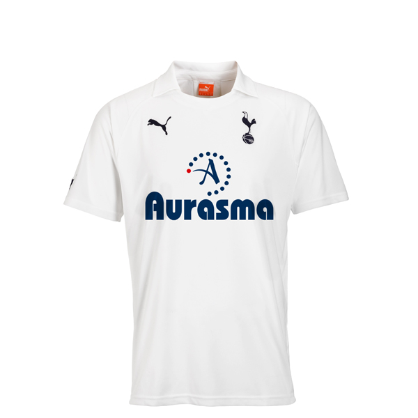
The new Spurs shirt...it's very bold
Via the official site.
Lovely minimalistic design by Puma. Shame about the mental size bold fontface. I know a sponsor pays the money to have their logo on the shirt, but too much trouble to ask for them to match colours with shirt and perhaps sort of have a more subtle font for the name? It's not like nobody isn't going to see it if its slightly less boldy. It's on the front of the shirt staring right back at us.
Shirts are released on September the 14th. Clever.

Yes, I'm complaining. Only fair to do so after I did the same with the yellow-streaky shirt. Still, on a positive note:
Bold > yellow streaks
So hands up if you're gonna get Modric 14 printed on the back?
UPDATE:
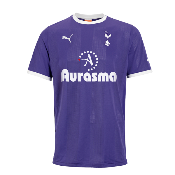
Oh Christ. I had not seen the third kit. In a rather cruel twist of irony and fate, here it is:

Bold AND a random yellow streak.
Wow.
I...have...nothing...more...to...say....
 spooky

Reader Comments (63)
Here's the one with the Yellow streak!!!!
http://shop.tottenhamhotspur.com//prod_images/largeproduct/mtss11.jpg
I can't look at "Aurasma" without seeing "Orgasm".
Help me.
Spooky it's a fake mate... check out this - http://errorlevelanalysis.com/permalink/d37413d/ this website can detect "photoshopped" images. Read the blurb under the images and it explains what it means.
Love the purple one and sure a bit of tipex will work on the red dot!
Might actually buy a top for the first time in years.
Still will prob look better with investec
Looking at the images on the official site the images are faked there... or that website is saying they are. They have photoshopped them and dont have actual images?
That logo is FOUL!!!!!
Hmm. I really can't get that out of my head.
http://i.min.us/jdbkd8.png
audere.. its from the official Spurs website.. its not a fake. all three shirts are available to order. White, dodgy purple and Black with yellow streak!!! ya div.
look on the spurs website, they've been launched, then tell me about photoshop.
I kind of fancy the purple one and the new home shirt is growing on me. Hard to beat last years home shirt I'll probably stick with that one and maybe add the purple one to get a little more color in the closet.
Photoshop doesn't mean fake. Official images of kits are normally photoshoped to make them look better than they would in normal life.
I'm with you on that JS...not literally mind...Aurasma? What about her Dad? and where did Tonomy go? Dread to see next years...and PURPLE?! You 'kin what!?
If the prices weren't so high, I'd be going for the home and the black shirts.....
Unfortunately, given the choice of a shirt, Star Wars Blu-Ray or LA Noire, the shirts are coming in last place.
Dear God, it's purple. Purple. Slightly striped as well. I mean, we've played in purple before ,no biggie, but this looks like Newcastle's away kit bathed in radioactive grape juice. Cripes. Home kit looks spectacular, or it would if, as you so wisely observed, the font for Autonomy's Iphone app didn't look like it came from the title of a strange German porno. Third kit looks like something Young Boys would wear. Still, the home one is quite dashing, so i'll forgive Puma their outgoing fumbles. Can't say I'm looking forward to having an American company manufacture our kits from next year, either- i'm seeing bright red stripes and stars everywhere.
Js - "I can't look at Aurasma without thinking orgasm"......is that so bad?
wonder if its possible to get one of the white ones sans Logo...
@nikitak13 what's bad is that I then 'shopped a version of the shirt with it on.
I actually like all three of them which is a first!
The white one is class, all white is true Spurs.
Purple one looks great and I hate it when we have baby blue/navy kits so big upgrade.
The last one may have yellow but it looks good.
Best set of kits as a whole in ages.
Love the third kit, very interesting in a retro funky kinda way. The home kit is a nice classic design ruined by the Orgasmo logo, and the purple kit makes me think I'm suddenly supporting Fiorentina. Since when has purple been our away colour?
@nikitak
it is when you're watching Defoe sky a tap-in from two and a half yards...all the orgasmic ecstasy in the world won't stop you cringing, no matter how big and bold the 'Aurasma' on his shirt is.
Am I colour blind? The away kit is hideous, looks way too much like Chelsea to me.
I quite like the plain white home kit although I’m not really a fan of the collar.
I’ll definitely be looking to buy the Investec kit again when it comes out, Aurasma looks like crap. Also what the fuck is an "Augmented Reality Platform" sounds like something out of Total Recall, not the content management business Autonomy are in. I think I hate them more than I did Thomson and Mansion!
Third kit is ok IMO.
The Investec one will look the dogs
Home is great and 3rd is acceptable, but what's with the PURPLE? it's a f*ckin woman's colour.
F*ck you, Puma!
And the Yellow P*ss streak on the otherwise tasteful 3rd shirt?!
They peed on our f*ckin shirt again. That's right Dude, they peed on our f*ckin shirt.
On the official Spurs site it looks as if Modric is already wearing the chelsea kit. I'll wait until next season to see whether Under Armour the scientific and innovative American sportswear giant (look them up) can avoid making our blue away kit not look like the chelsea home kit. The other two are mediocre at best. collars and a hideous stripe, who gave these the go ahead. Sorry Puma, You're fired.
DubaiSpur....think Defoe will spend the first half of next season mostly warming the bench, then get sold in January, so I'll stick with the Orgasmo
JS...is there a typo in your response, or am I missing some subtle allusion?
Under Armour are pretty huge this side of the pond, they've come a long way in a short time and their kits for other teams (see Hannover) haven't been too bad. I think next year's will be interesting as long as they don't make them tight like the old Kappa ones.
I just think it's disgusting that we have to wait until a month into the season to get our shirts, when others are available now. NOT impressed.
What no shirt with a Europa League specific sponsor?
It's a shirt designed primarily to highlight more than other shirts, the sponsor.
That said, it's quite nice. I'd do anything for a sponsorless one.
The Investec one will look the dog's bollocks. At the very least the font will be slightly smaller than Aurasma's aircraft-carrier size lettering.
i quite like all of them to be fair, quite retro and very early 90's football italia esque! I do agree though that the investec logo should be preferable
Awful. Does anyone actually sign off on this s*it?
Seems like Puma, having been made aware of our move to Under Armour next season, have provided us with a lovely parting gift
I have purchased some Under Armour gear for golf and general sporting things and the quality is really good. Not sure how the designs will be but I have no doubt the shirts will be quality in the way their made.
@nikitak13 'shopped. Short for Photoshopped. Okay fine, I used Fireworks:
http://i.min.us/jdbkd8.png
Are they going to be available to buy with the Investec logo?
...here's hoping they are.
The third shirt looks like something you'd get for passing your cycling proficiency so let's skip that one altogether. The away kit is kind of acceptable in that it's different, but would have looked better in a deeper purple. And as for the home shirt - hard to debate a white t-shirt. But on all of them that logo is garbage. Sack the brand manager! And the designer (assuming that one was involved).
If the 'Aurasma' font wasn't so BOLD and in a thinner style it might look like a very nice kit but it's completely ruined by the Orgasma crap.
If only Puma had a designer as such!!!
http://1.bp.blogspot.com/-So2Pz_ZmNdI/TcJ2tAHVJ5I/AAAAAAAADPs/LYmbM6iL82c/s1600/123kitb.jpg
Home is nice classic, will be better no sponsor obviously but would settle for investec,Away i find surprisingly nice but should be our thrid kit and Why have we got a Black kit its not a Tottenham colour we've had it once before and that was for puma sake, purple we have had a few times. I cant remeber us ever having an away kit without a shade of blue, I was hoping for a classic Navy Blue with White shorts instead we gt a real shit newcastle training top we gt
Third kit looks like a road at night...I actually *cough* like them all...weird.......I usually hate them....
Hmm the logo looks like one of those loading things on a pc screen that gives you a migraine
You can get one of those watching us against Wolves.
Bold? It's fkng 'orrible!
Terrible collar (uber naff sponsors but not much we can do there! - but a giant fkng 'A' on our shirt??!!!), and WTF is the away kit? Purple? The black kit is a 1990's disaster and whole shebang is frankly awful. Seriously. WTF!
Im just going to stare at the kits posted above - View Kits - and pretend this is what we will be wearing
Not so long ago we were sold the idea that Glory comes in three colours. Well, two of em appear to have gone AWOL. And no, you can't count the crap stripe!
The away kit's been nicked from Harchester United.....
Isn't Aurasma the fat girl in the Ricky Horror Show ?
Homeshirt is quite the business; but would be even better with blue trim around the collar and cuffs. 2nd and 3rd kits are not bad at all, and I actually think the 3rd is striking!
Wow ?
World of Warcraft. They pay me to sneak in a subliminal ad or two.
@delboy
holy shit those are nice. Where'd they come from?