Via the official site.
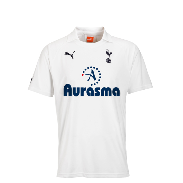
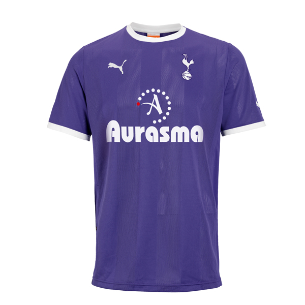
Lovely minimalistic design by Puma. Shame about the mental size bold fontface. I know a sponsor pays the money to have their logo on the shirt, but too much trouble to ask for them to match colours with shirt and perhaps sort of have a more subtle font for the name? It's not like nobody isn't going to see it if its slightly less boldy. It's on the front of the shirt staring right back at us.
Shirts are released on September the 14th. Clever.

Yes, I'm complaining. Only fair to do so after I did the same with the yellow-streaky shirt. Still, on a positive note:
Bold > yellow streaks
So hands up if you're gonna get Modric 14 printed on the back?
UPDATE:
Oh Christ. I had not seen the third kit. In a rather cruel twist of irony and fate, here it is:

Bold AND a random yellow streak.
Wow.
I...have...nothing...more...to...say....