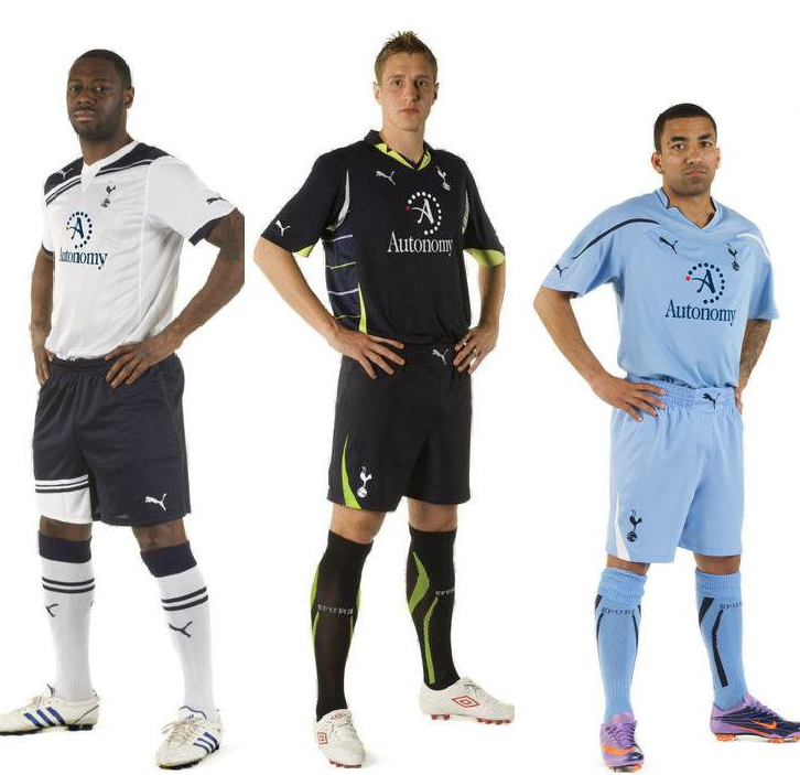
Brand spanking new Spurs kits...
 Thursday, July 15, 2010 at 9:16PM
Love the white. Not keen on the blue. The third isn't too shabby. I'd still prefer to spend my hard earned cash on the white training top (which resembles the white home shirt). Something about no sponsorship turns me on more.
Photo found via the SI Football Manager forum, via Spurs Community (edit: sponsor appears to be photo-shopped onto the images, but I guess you could call them 'official mock-ups').
Massive King photo for you to drool over, click here. And some kit discussion if you're interested in some banter.
Oh, and yeah, the red dot is with us, at least it's not of Mansion proportions.
 spooky
New kits on official site, click here to go to the OS article. Looks like the blue on the Autonomy is a different shade to the blue on the rest of the kit. So meh it still looks photo-shopped. Regardless, the home kit is far far better than the yellow-streaked one of last season. The shorts however are genuinely shocking. Training track suit top all the way for me.


Reader Comments (91)
You've got red on you. :/
Can't help it... the white one looks like a Bolton shirt to me.
Actually, the second is this photo is our third kit, and the third in the photo is our away kit, I guess :)
If You want, you could also use this photo, Spooky http://o.imm.io/Tmm.jpg
Love the white and aye, the blue is rather crappy...
which is the away - the sky or navy ??
Looks like a CL kit.
jimbo, the sky is away :)
And The Sky's The Limit, of course!
Ledders wears adidas now? He was a Puma King.
Agree about the no sponsor effort being the more likely purchase - Autonomy should be in matching blue on the home shirt. Looks a bit balls as is imo.
when can i buy them is more the question......i want it before the redbulls game......
They all look really happy to be there.
Tomorrow is the launch date.
whats the point of the navy - when are we ever going to wear it
say we play west brom or blackburn or wigan away which shirt would we wear ????
All about the $$$. Fans will lap it up I guess.
The sky blue is actually the away as I have seen an email from Puma which didn't contain the middle one (of Dawson). Which as the third is only sold via the Spurs Shop makes the blue the third.
All 3 kits are shockingly bad. Worst kits I have seen in a long time. The home shirt would look good with no sponsors logo, but looks awful with it. Oh well, more money for beer!!!
i still dont understand when we would ever wear the 3rd kit
they'll all do for me if this year is even better than last
How long before we are labelled 'Automatons?'
white home shirt looks great then you notice the sponsor brimg back holsten
HUGE improvement on last year but I'm keen to see who the sponsor is for the non PL games as I can't stand Autonomy as a company, professional differences if you like.
Who cares about the shirts? What the fuck is Lennon wearing on his feet, the prancy twit.
Quite liked the home shirts retro feel when I first saw it, but now the new sponsor is on it, it just doesn't look right to me ! Maybe if Autonomy was in the same colour blue as the shoulders/shorts it would look better??
I out of the 3, I like the navy one best as the colours match much better ! ( Maybe because sponsor is in white )
Is it me, or are the sponsors CLEARLY photoshopped, fairly badly, onto the untarnished kits? The logo best actually be a matching blue on the home shirt IRL
I like the 3rd kit (the middle one in the photo)
I prefer the retro shirts in the club shop and if the white one had no sponsor on it then I'd opt for it. Don't mind the sponsor this season its about 100 times superior to the red infected Mansion one of the last two.
Where's that bloke who reckons he works for Puma, ElCid? ;-)
like them but why green on the 3rd shirt
and what shirt will we wear when we play wigan/west brom/blackburn ?
Its gonna be the 1st home kit ive got for years. I like the navy one as well. Never liked sky blue kits. As for it looking better with no sponcer.. Of course it would but it aint gonna happen
I don't mind the home shirt but man, the shorts are hideous!
Its gonna be the 1st home kit ive got for years. I like the navy one as well. Never liked sky blue kits. As for it looking better with no sponcer.. Of course it would but it aint gonna happen
Is it just me or can you see the scars on Ledley's knees from keyhole surgery on the super close up? I like all the shirts more than their equivalents from the season just gone, although i'm not sure about the white edge to the home shorts.
Shorts are poorly designed. Why do they always have to add in these changes, none of which are subtle and more often than not appear to be there just to justify a change. White shirt will still be bought, first one for around 3-4 years.
They're an absolute visual atrocity.
Looks like they were designed by a German that's been through some sort of mid-life crisis.
What's so difficult with making a simple design, done with taste?
F*ck You, Puma! Bunch of F*cking Amateurs.
I make you right there snow_brigade. There's something not quite right with how the logo's look on these shirts.
Aside from that. THe shorts on the home kit, Funny stripes on one leg. Really? And what with the big puma on the 2nd/3rd kit shorts...above the crotch area?? The navy kit looks like it's been designed by Stevie Wonder who's going to be signing shirts during the San Jose friendly.
I'm not convinced. I wonder what the CL kit will look like. A completely different look for Cup competitions is it? Adidas I hear.
Mind you I wasn't too fond of ;ast season home kit, but it's a classic now in my eyes. Do even better in this new kit and I'll have another couple.
Love the white kit!!! The black / navy one is definitely was unexpected.
Like the home kit much more than last year's offer but the neck lines are too fussy. A simple, stylish v-neck would have made the home shirt a near classic but the designers at Puma seem to have put an odd little white triangle in there which looks a bit odd (or are my eyes on the blink?).
Top marks to Sarge. Loughed out loud.
Do you think the photographer asked them what they thought of Fabio?
Re : the photoshopping probably had the players posing weeks back when the shirt was delivered to Spurs and added the sponsor on.
The home kit is really nice, even with the sponsor. The others are quite bad. I've always hated the light Blue kits. They're vile.
It does look like they've had the players pose in the new kits, weeks back, probably before the sponsorship was announced, which would make these shirts official club mock-ups. Possibly. When they launch the shirt, no doubt the official site will be carry a ton of pics - so we'll find out if the sponsor logo matches the blue on the home shirt exactly. If it doesn't...meh.
Never red, I understand. But what in the name of God is with the green on the third kit? Let me guess, we had green in our old badge, so that constitutes green in the new one.
Bring back the yellow streaks.
Wow the third and away are horrible. Really, really horrible. The home kit is ok apart from the shorts...which look ridiculous but will probably grow on us/be tolerable. Wish they'd just gone with the word "Autonomy" in plain blue...that logo dominates the shirt. Still, could be a LOT worse. We'll have to wait and see who the CL sponsor is (seems to me that they're waiting to see if we actually qualify...if we do then thats the shirt I'll probably buy...if any)
the largely unknown sponsor's logo on there makes the whole lot look more championship than champions league.
maybe if all the kits had followed the assymetrical theme they might not have been so bad, but as it is they just look a bit uncoodinated and tacky
not surprised that the players look so grumpy
is that a strap on ledleys right knee??
Never mind Lennons Boots what about the hands on the Hips what is that all about thank god the Kit is not pink .I don't like the white on the shorts it looks like a thigh bandage the Navy is a grower it could be like the piss stains it gets better if we win in it . The Blue is more like Coventry and the shorts first kit would be better with white shorts and the blue running at the bottom cant you mock this look Spooky just to see what it would look like Oh great One.
Why do the away and 3rd kits look like they have a massive puma belt buckle on the shorts. Yeeeuch!
Whatever happened to black boots? And whatever happened to Puma Kings? Am i the only one who wears them nowadays???
oooooh..... wicked cool midnight release
Just seen Crouch in the Spurs HOME shirt - the sponsor is Light Royal blue!!!!!!!!!!!!!!! WTF?????
RELEASE DATES:
- Limited Edition third strip - Saturday August 14
- Home strip - Friday September 24
- Away strip - Saturday October 2