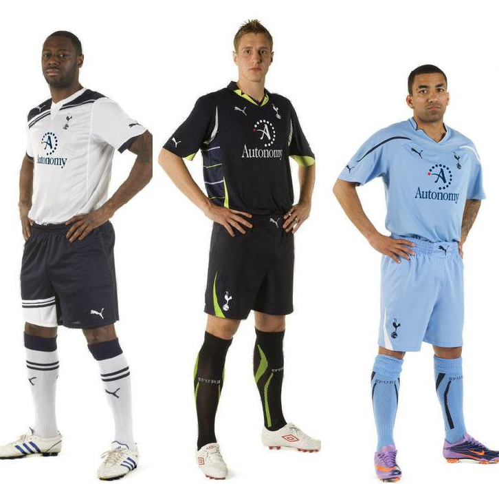
Brand spanking new Spurs kits...
 Thursday, July 15, 2010 at 9:16PM
Love the white. Not keen on the blue. The third isn't too shabby. I'd still prefer to spend my hard earned cash on the white training top (which resembles the white home shirt). Something about no sponsorship turns me on more.
Photo found via the SI Football Manager forum, via Spurs Community (edit: sponsor appears to be photo-shopped onto the images, but I guess you could call them 'official mock-ups').
Massive King photo for you to drool over, click here. And some kit discussion if you're interested in some banter.
Oh, and yeah, the red dot is with us, at least it's not of Mansion proportions.
 spooky
New kits on official site, click here to go to the OS article. Looks like the blue on the Autonomy is a different shade to the blue on the rest of the kit. So meh it still looks photo-shopped. Regardless, the home kit is far far better than the yellow-streaked one of last season. The shorts however are genuinely shocking. Training track suit top all the way for me.


Reader Comments (91)
I love the white one and I even like the simplicity of the logo. much much better than the massive mansion logo with chinese inscriptions
racist
WORST SPURS KITS I HAVE EVER SEEN,THEY LOOK LIKE THE £5 PUMA TOPS YOU CAN BUY AT JJB SPORTS OR MATALAN ,A TOTAL AND UTTER DISGRACE ,PUMA CLOTHING IS TRAMPS CLOTHING ,THERE IS NO WAY THIS GREAT CLUB SHOULD BE ASSOCIATING ITSELF WITH THIS BRAND,OUR IMAGE HAS BEEN CHEAPENED AND I WOULD NEVER BUY ANY SPURS KIT MADE BY PUMA
agreeing with most of the comments here but come on they're not that bad, are they? the home kit is pretty nifty, if a tad boltonesque and the shorts may look silly but they're sure to get less offensive as the season wears on. also, take a look at the dark blue kit again and try to ignore the admittedly crappy-looking side bits which won't be too prominent anyway - again, a nice kit imo. never been a fan of the sky blue so meh anyway but all round not too shabby. if anything, the worst detail is the overcomplicated collar on the 2nd and 3rd kits (reckon it works well in the white). and the puma belt buckle. that's just silly.
The white stripe on the shorts is a tribute to the bandage around Ledley's knee.
I personally think it looks great.
With a cockerel a puma and the "A" across the shirt you can't be more positive!!!!
COYS
I've been waiting for an old school kit like this for years !!!
Kayaka I agree with u about the 2nd and 3rd kits but KING, ain't got a clue where you're comin from son ???????
Absolute Crap ! The best kit we ever had was the Adidas one. GET RID OF PUMA AND GIVE US ADIDAS LEVY.
I think we got spoiled by seeing it without sponsorship.
didnt like last years due to puma styling .(yellow cubscouts kit)......dont like this years due to puma styling............
(appears cheap. with the autonomy logo as well)....in a world where opinions differ on whats looks cool etc.......
( retro versus modern)
one thing for sure is puma seems to letting THFC down.........on the main kits
like us to look like a real madrid or something.........
this is going round in circles on the marketing im afraid
so who at spurs is allowing the blooming obvious to continue?
Sir keith Mills !! ..........age ............58!?
£45 quid a pop.....? Not available til sept time.....the price of prevarication Mr Levy!
Looks like Ledley has wood
The release dates for the shirts are a bit late aren't they!
Dawson looks like a can of Strongbow - bless him.
Don't like the home kit Ledders is wearing with the stripes in the shirt/shorts
Lennon and Dawson look ok though as the colors are at least consistent.
will the CL kit be the same just different sponsor, or actually different kit
I love the sky blue one - I guess that the navy might get used in Europe a few times next season
i presume we will wear all white for CL, but im not sure whether the shirt is the same
Which shirt will we wear when we play blackburn or west brom
anyone seen goalie kit - its brown looks like shit
I like the light blue, the white is better than last years, but I'm afraid I just dont think back to the 80's with fondness, it's a bit like the cars of the era all I remember are rust buckets from your Datsun Cherries to TR7's. As for the dark blue, hrm, where did the lime green idea spring from? I could imagine the same strip with it replaced by white, yellow, light blue or purple and it works, but lime green? (biased due to my favourite still being the dark blue/purple affair we saw Klinsmann debut in)
Cant say I'm overly joyed about having a BIG A slapped across the middle of the kit. It reminds me of the A that was on the scums old badge!!!
in making our debut in the Champions league and new stadium.............
can the marketing decisions reflect the direction the clubs going in please as
two designs should be considered .............a great spurs retro shirt aka..........chivers etc
and a great modern version with a balance in the graphics and colour wayswithout cheapening the status of the badge......etc.........either would be sold in droves..
maybe next year ........new shirt company may resolve it but the design brief has to be met
does it take a year to talk??
it doesnt matter on the pitch of course but a lot of many is being spent to make this club a stylish home in brix n mortar..........
good luck for CL
additionaly..........
Roger Harrison, Puma's UK marketing director, said:
"We have worked extremely closely with the club in developing a really strong and exciting new range of Tottenham Hotspur kits.
Rogered again!
Not sure if I like it. I think the Autonomy logo above the name kills it. Would have preferred just the name, But I guess when they give big bucks, you have to deal with it
Average and a poor effort. Roll on Adidas for the following season... If the stories are to be believed? I think Puma have overstayed their welcome with this load of scruff. It's Spurs, on that basis i like the home best but the best of 3 very unimaginative designs... "I KNOW. WE'LL DO AN 80'S RETRO KIT.. HOW ORIGINAL WILL THAT BE, HOW EXCITING!!" Do me a favour... LOL
Blech. Blech. Blech. The white one's the worst of the lot. Retro is one thing, but I agree with those who think it looks cheap and simple, like something my mom might've picked out for me off the discount rack at K-Mart in 1976.
I'm afraid to see Man City's new kits.....
Any idea's for next season's kits? haha im already bored of these ones. Would'nt mind Umbro next season, they make nice plain kits, just look at Man City's.
again spurs have ripped us off - u can only get the home kit on 24th sept so u cant wear it to the first game
BUT of course u CAN buy the 3rd kit for 1st game - get rid of 3rd kits to make an extra buck
conned again
Kit update - http://www.tottenhamhotspur.com/news/articles/kit-update-160710.html
I think the type of update people want is: "Here's the Adidas kit now"
The England ODI Adidas kit (that's cricket for you charlatans) also have those lime green underarm thingys, I would think it's some constituent of the Climalite technology - body temperature dispersal jiggery pokery.
Come the Tues 7/ Wed 8 December when we take the field at WHL for our last group game, having already qualified for the next round with an away win, that navy blue/ lime green concoction will look majestic under the lights. Can't wait COYS.
altered new kit.......
the yellow may upset a few.....
see
http://s179.photobucket.com/albums/w320/webster45/spurs%20kit/?action=view¤t=smileykits2.jpg
That training top is fucking LUSH, why the horrendous overly fancy necks on the 2nd and 3rd kits? Who is going to want to buy that?
the shorts carry puma's recent designs for many of their teams. they are supposed to look a bit like boxers' shorts (as in the sport, not your undercrackers) In their press materials it says it's to reflect the combatitive nature of the sport!
or ledley leaving a nightclub...
i like the home shirt. third kit is horrendous and i don't like sky blue as a colour let alone to two different coloured slashes on the top. but overall i would only ever buy a home shirt and i like that one. think it will look better in real life.
What I ahve noticed (see my shorts comment above) is that there are a lot of bits of design on this shirt that are consistent with a lot of former/current puma football shirts. for instance the funny collar on the 2nd and 3rd shirt is the same as the Italy world cup shirt which was designed to be in a star shape to reflect the star you get on your team badge when you win the tournament. Is it too much to ask that they actually designed something completely original that was based on spurs traditions instead of rehashing current designs to save on costs? With this being Puma's final year as our kit supplier it seems they've just got lazy.
none of those look or feel like Spurs shirts...the Home kit looks like Bolton...the Navy Blue looks like Man City Away...the sky blue is OK but I dont like seeing Spurs in sky blue...not after 87 anyway....I'd be happier with a plain white shirt with emblem and plain blue shorts...simple...