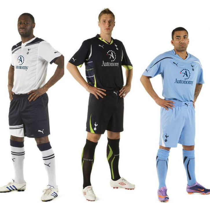
Love the white. Not keen on the blue. The third isn't too shabby. I'd still prefer to spend my hard earned cash on the white training top (which resembles the white home shirt). Something about no sponsorship turns me on more.
Photo found via the SI Football Manager forum, via Spurs Community (edit: sponsor appears to be photo-shopped onto the images, but I guess you could call them 'official mock-ups').
Massive King photo for you to drool over, click here. And some kit discussion if you're interested in some banter.
Oh, and yeah, the red dot is with us, at least it's not of Mansion proportions.
 spooky